Thursday, November 17, 2011

WK12 Movement and Motion

Portal 2 Diagram
From: HalfLife2.net

This is a diagram from the Portal 2 game; there is also an animation of the Aerial Faith Plate in action http://www.youtube.com/watch?v=fE3B9uGnVlA . What is interesting about this image is that there is implied movement that is obvious to the viewer. There are arrows and lines that show direction from several launching pads known as Faith Plates. It shows different objects being launched and their direction of movement. The middle-most plate with the largest objects move toward the lower-left part of the diagram, which leads to the title of the diagram: Aerial Faith Plate.

A Feature of the Nintendo Power Magazine.
From: Zeldac.com

This feature from the Nintendo Power Magazine is about the upcoming game The Legend of Zelda: Skyward Sword. The layout of these two pages give an impression of implied motion. The blue streak from Link's sword shows movement and direction with diagonal stress. There is also minor event perception of the sword's implied motion. Someone can think that the sword is slicing the word "Legend" into two parts because of the way the text and image is set up; however, there is no real event, only crooked text and an image in a layer behind the text. Link is the main feature of this game, because he is the main character; therefore, it is only right to catch the eye of the reader with him and his sword, leading in implied motion to "YOU ARE LEGEND."

Sunday, November 6, 2011

WK11 Dimension/Depth/Space/Scale

Dimension, depth, space, and scale are key factors in Mirror's Edge. This game requires the player to run and run consistently for whole minutes at a time, jumping from rooftop to rooftop, in order to escape those who are hunting her down. The art in this game is very minimalistic, without too much detail and putting emphasis on gameplay. However, because of the style of the game, dimension of walls, buildings, structures, and miscellaneous objects need to be clear. While being played on a 2D surface television, the graphics are made to be in 3D with multiple perspectives. Therefore, the distances between the runner an object or goal need to be scaled accordingly, and the sizes of buildings need to be accurate so the player can map out an escape route correctly; depth and space are accentuated through the objects on the 3D plane, like police men, poles to lunge over, ladders, and doors.

The 2D artwork on covers and posters need to reflect these details, as minimal as they are. The buildings face down into a vanishing point. Policemen and helicopter are small in the distance. "Swoosh" effects of her movement and the shining action lines around the main character also show Linear Perspective. Police show scale to the size of a building. Proper shading, texture, and color provide dimensions to faces of buildings.


http://images.wikia.com/mirrorsedge/images/a/a2/Faith_chase.jpg


It is harder to see scale in this image because of the lack of reference (such as people). But there is still a Linear Perspective.


http://www.geekshow.us/wp/wp-content/uploads/2009/03/mirrors_edge_logo.jpg


There are also depictions of the main character in a crowd of people, which is accurately given dimension by shrinking the crowd into the distance by vanishing point. People are not on top of each other and feet are not stepping on each other.

http://i.neoseeker.com/mgv/1-Redemption/1/13/mirrors_edge_guide_cover_display.png

Thursday, November 3, 2011

WK10 Tone and Color


TONE
This is the gameinformer.com website front page. The website itself uses high contrast themes and well organized layouts. The logo itself is in a dark grey (not black), with a light blue accent. The current website as of November 3rd 2011, uses shades of grey in the main task bar--these are examples of usages of tones. The three main and most popular sections--News, Reviews, and Previews-- are highlighted in a midtone dark grey, and to the left of it is the "Platforms" tag (that lists the current electronic gaming consoles) which is highlighted in a lighter shade of grey. The rest of the bar is in a really dark shade of grey, which looks almost black (according to Photoshop, the color hex is #181512, not #000000 black). This subtle grey-black makes the website seemingly sophisticated because of the usage of a complex grey color than just straight black. The main text is also not in black, and uses a dark shade of grey; the text is still legible but again, makes a subtle difference of sophistication than typical black text on white background. The feature article is boxed in a light grey which complements the dark grey text and allows the text to still be seen. The bar at the very top with the "Join" and "Sign in" links is also not completely black; although it has a black base, it has a subtle grey pattern over it; this pattern makes the site look more "tech-savvy". The usage of black is mostly avoided in this front page.

COLOR
This minimalism-like theme uses accents of color (other than the images used). Links are highlighted in blue, the "more" links are boxed in blue with white text. There aren't any colors than the single shade of bright sky blue except for the single link for the "Home" tab, which is highlighted in the opposite color bright orange. This blue accent corresponds to the blue accent on the "i" of the gameinformer logo. The usage of this color is to catch your eye; the blue is used on tabs on feature articles, arrows for drop-down menus, and the hyperlinks as stated before. This usage of single colors is to catch your eye, to mean progression through the website, and transport the user from page to page via these little blue links.

Thursday, October 27, 2011

WK9 Video Game Graphic Design

Focusing on logos and their development from video game consoles, old and new:

LINES
 https://blogger.googleusercontent.com/img/b/R29vZ2xl/AVvXsEg7aPkLEaTit0QFxebtb4zFFlMqaUbEt9IIZRA3qu7bVzHqluVao9Wm5RSKetXp1hyIWG8yENcj52oBI_j61E2xMSZJRwAUNIRRX19CtOMlKv-mnVxbZQj0aZb9zJoRVJGHmdTSrCal6hCq/s1600/Nintendo64Logo.png
Lines will be actively used in graphic design in order to outline quick, general sketches for website layouts, logo shaping, dimension, and texture. In terms of the Nintendo 64 "N" logo, lines would be needed to outline the two-point perspective in dimension of a four panel "N" shape. With the line being an essential tool for previsualization, it is capable of being manipulated in forms that are non-existent, but only in imagination. (Dondis) The line is also used for standard notation, such as the Alphabet letters and Arabic numerals in this design such as six and four. (Dondis) The name itself had to be initially written down in notepads over and over again to obtain Nintendo, a company founded in Japan.

COLOR
The existence of color, and/or the lack thereof is an essential tool in graphic design. Especially in videogames, where graphics and eye catching is key, color will bring the emotion, category, and predisposition of the game to life. For example, in the previous image, the "N" logo was set in four bright colors: green, red, yellow, and blue. Three are primary. Besides the function of shading and highlighting the "N" to see it in three dimensional perspective, the four colors give the logo a predisposition of playfulness, and enticement. It's colors are carnival-like. These composition of colors attract people, especially children, to play this console (which was actually came in dark gray initially, and different colors such as purple and green in later developments).


http://dailygadgetreview.net/wp-content/uploads/2011/05/playstation-logo.jpg

The PlayStation logo by the Sony company also utilized these four colors initially to entice customers, attract children, and give off a sense of fun and enjoyment through usage of this bright colors. However, the usage of full-on red for the incomplete "P" made it more serious than the "N" in the Nintendo 64 logo, and perhaps encouraged a more sophisticated type of fun. These two companies rival to this day in gaming consoles alongside Microsoft's XBOX system.

It can be seen in this image of the progression in the PlayStation logo design the the three primary colors were used for basic purposes. However, the green was implemented in the very last design in order to define the "S".

DIRECTION
http://www.logostage.com/logos/playstation2logo.jpg

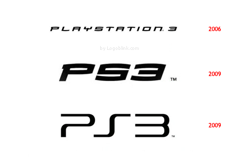
Further development of these consoles, focusing on Sony's PlayStation logo, allowed improved video graphics; therefore, there was an urgency to change the logos after subsequent systems (and the PS3 logo changing twice in three years). In shape, the more sophisticated PlayStation 2 took a more Gestalt approach with an incomplete and minimalistic "P", a two-directional "S", and a boxy two. It also only used two colors: purple and blue in a gradient fashion.
http://logoblink.com/wp-content/uploads/2009/09/ps3-new-logo-design.png

In the third installment, the 2006 PS3 logo had become italicized, giving it direction, such as going forward with progression, almost like a car. Three years later, the shortened signature logo was just the "PS3" than the whole name "PlayStation 3". It kept its slight italicized style. With the usage of differently weighted lines, and reflecting back the classic PS2 logo, it became a streamlined version of the PS3 logo in late 2009. With slightly bold lines, squashed look, and classic appeal, it used less ink and/or paint to print, and charmed older generations of gamers that remembered the great PlayStation systems.

Thursday, October 20, 2011

WK8 Gestalt


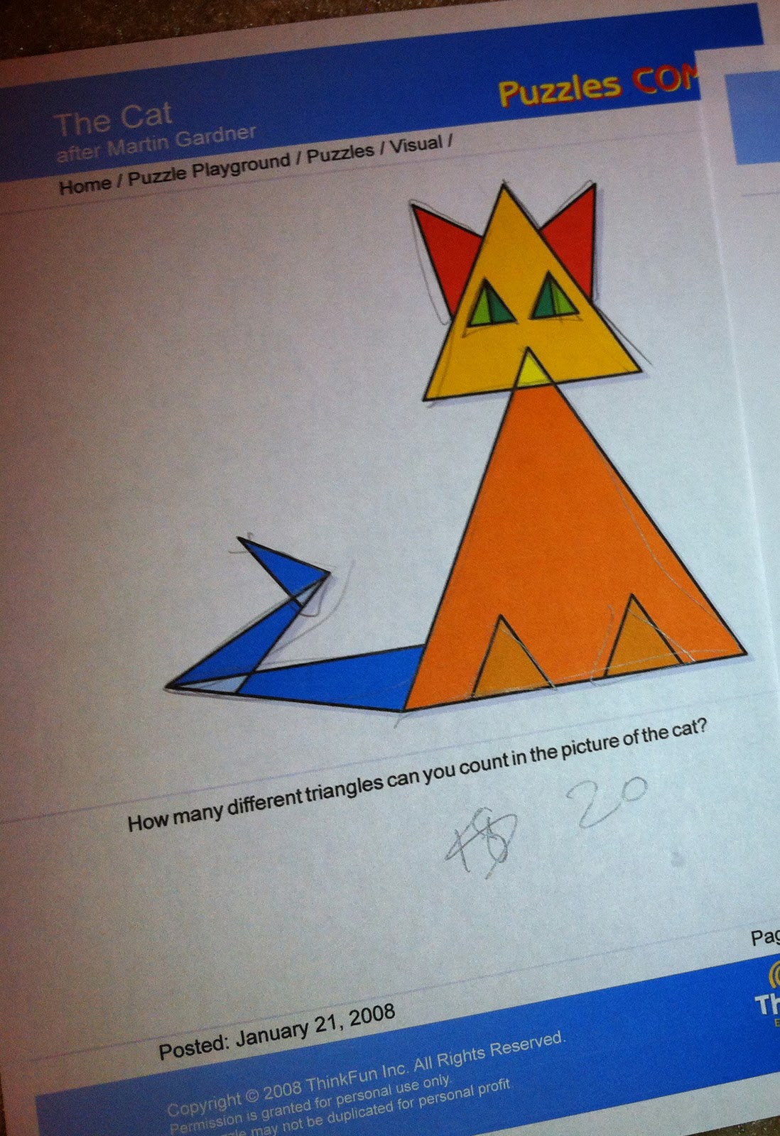
A roommate and I were to figure out how many triangles made up this cat:


My roommate did not write or touch the paper. He only looked at it and counted 20 triangles. A very smart man. However, he asked another roommate to check his answer.

I was a much more visual learner and traced triangles as I saw them. I initially counted 18, and then recounted 20.

We both used a law of closure to differentiate sizes of triangles and other triangles within each other.

We decided to figure out what month was indicated by these shapes:
Again, he did not draw on the paper but looked at it for a good five minutes and then folded the paper in half to show "July" being reflected on a horizontal axis of symmetry.


I initially traced a D-e-C for "December" for the first three shapes but it didn't figure anything. After fifteen minutes I gave up, came back after five minutes, and asked my roommate what the answer was. Apparently I have poor symmetrical visualization.

In the last puzzle, we both had to utilize the law of symmetry to figure out the puzzle.


Thursday, October 13, 2011

WK7 VisPerception2

http://www.gameinformer.com/b/news/archive/2010/07/23/new-infamous-2-character.aspx

The visual hierarchy of this cover for Gameinformer (in my point of view) is as thus:
the title is the brightest and biggest single chunk of information that the cover provides; eyes are then drawn to the face of the figure (because we as humans are drawn to human faces), and then to the lightning that is shown from his right hand to his left hand. After, the next brightest contrasting object is the pink, red, and yellow blob of color on the lower left hand side of the cover--over it the title of the game INFAMOUS 2; the two objects (blob and text) work together to pull the eyes away from the main larger figure on the cover and tell what the cover is depicting (as most gamers who subscribe or purchase this magazine are interested in the cover and what is being shown). The audience will then take in the background, such as the single red speck of light that signifies a gun firing at Cole (after knowing the title, most gamers will know that the man on the cover is Cole), and that the whole of the background depicts chaos with a building partially on fire.

Thursday, October 6, 2011

WK6 Visual Perception Top-Down

http://www.kickstarter.com/projects/justinrusso/video-game-posters


This poster is a very minimalistic example of a majorly popular icon in video games. Because I want to create posters for gaming companies specifically, I will analyze this based on the top-down visual processing.
By looking at the poster, it may not look like much at first glance; the rapid eye movements will scramble from top to bottom, and to reading the words at the very bottom. Eyes will then jump back up to the bulk of the design and start looking at certain parts for longer periods of time like the bold lines and the series of solid-color circles in order to figure out what the poster means, goal-oriented processing. If one were not familiar with the character, then eyes would keep seeing other points of the poster for longer periods of time. If the person is familiar with the character, the eyes will take in the poster as a whole character rather than parts of the character (Big Daddy from Bioshock).